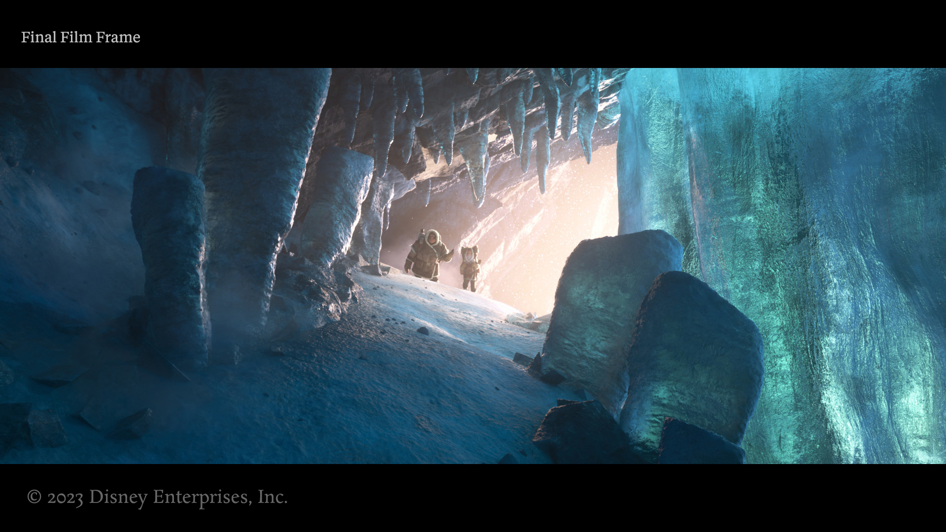
On Strange World, I worked on the look for the heavy ice sequence in the prologue.
Finding the right level of details along the forms and creating areas of rest took time to home in on. The environment needed to look believable, but not so realistic as to be distracting.
Ice and snow are also always challenging in CG due to refraction and subsurface being expensive computationally, but also because their look is extremely sensitive to final lighting setups. This makes the iteration time much longer than with other material types. This set was also seen in dozens of different angles throughout the sequence which required a lot of detailed shot-by-shot work.
I’ll show some highlights of the work I did and some brief explanations.
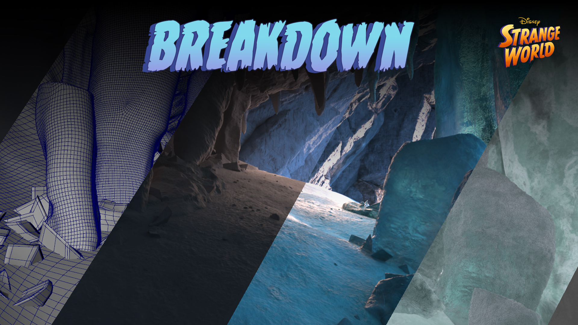
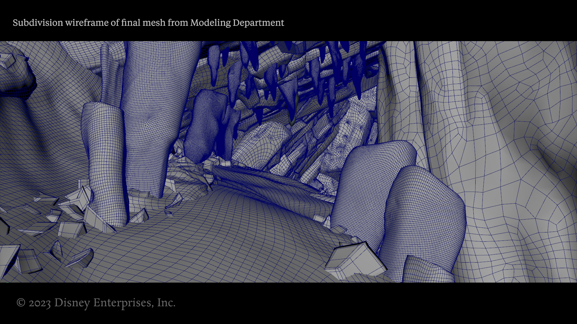
The Modeling department publishes a subdivision mesh. The wireframe below shows the topology. It might seem heavy, but the density is not a huge deal with adaptive subdivision, which limits subdivision density based on a metric such as edge length. The edge flow itself is also not as important for environments, because they do not need flexible deforming rigs. Furthermore, with Ptex, UV mapping is not a factor.
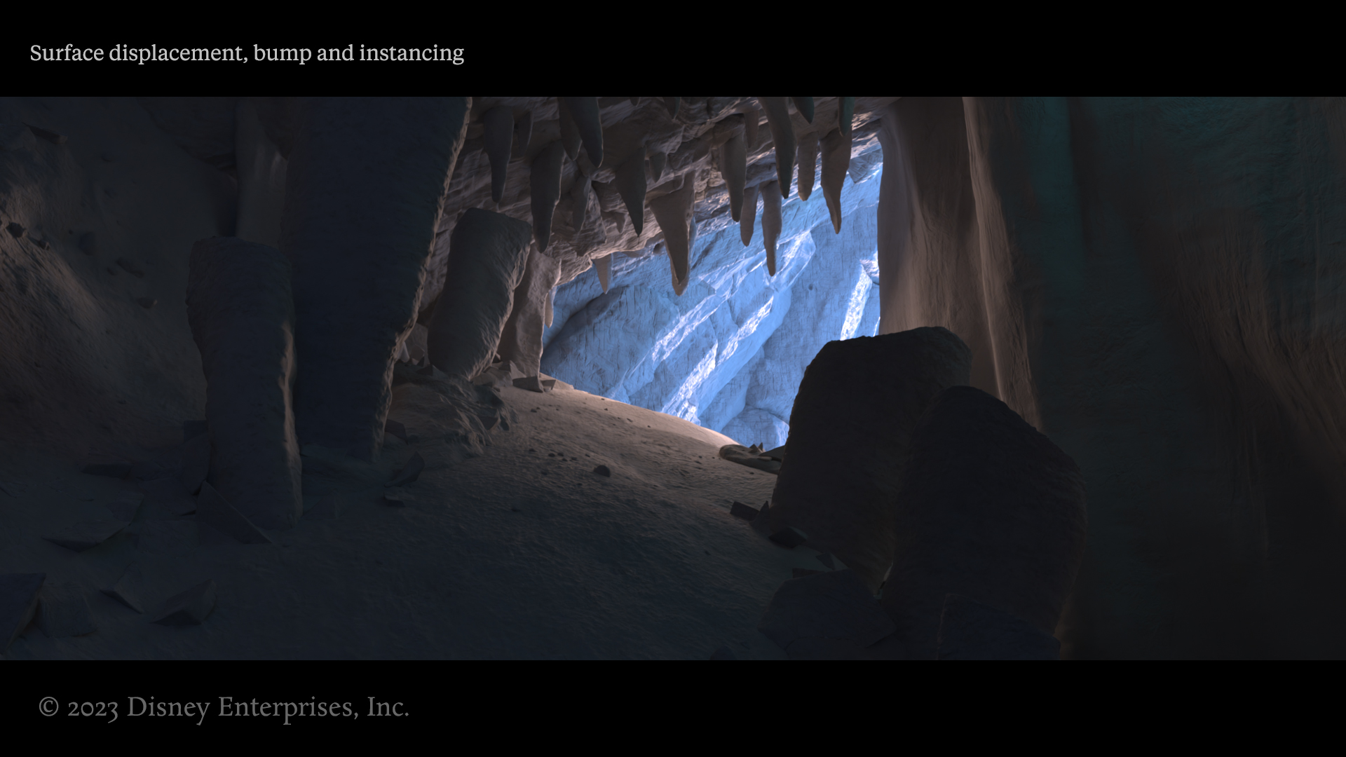
A so-called “clay render,” with no reflectance or color parameters applied. You can see the displacement work I authored along with the instancing, like the small rocks and pebbles, giving material definition before anything else is involved in the shader. Similar to viewing a digital painting in black and white, viewing 3D work in this way can help you judge the surface without distractions. Ultimately, many other shader properties such as specular roughness are cheats — approximations of geometric imperfections — so as a general rule, the more you can do with pure geometry, the better (when going for realism).
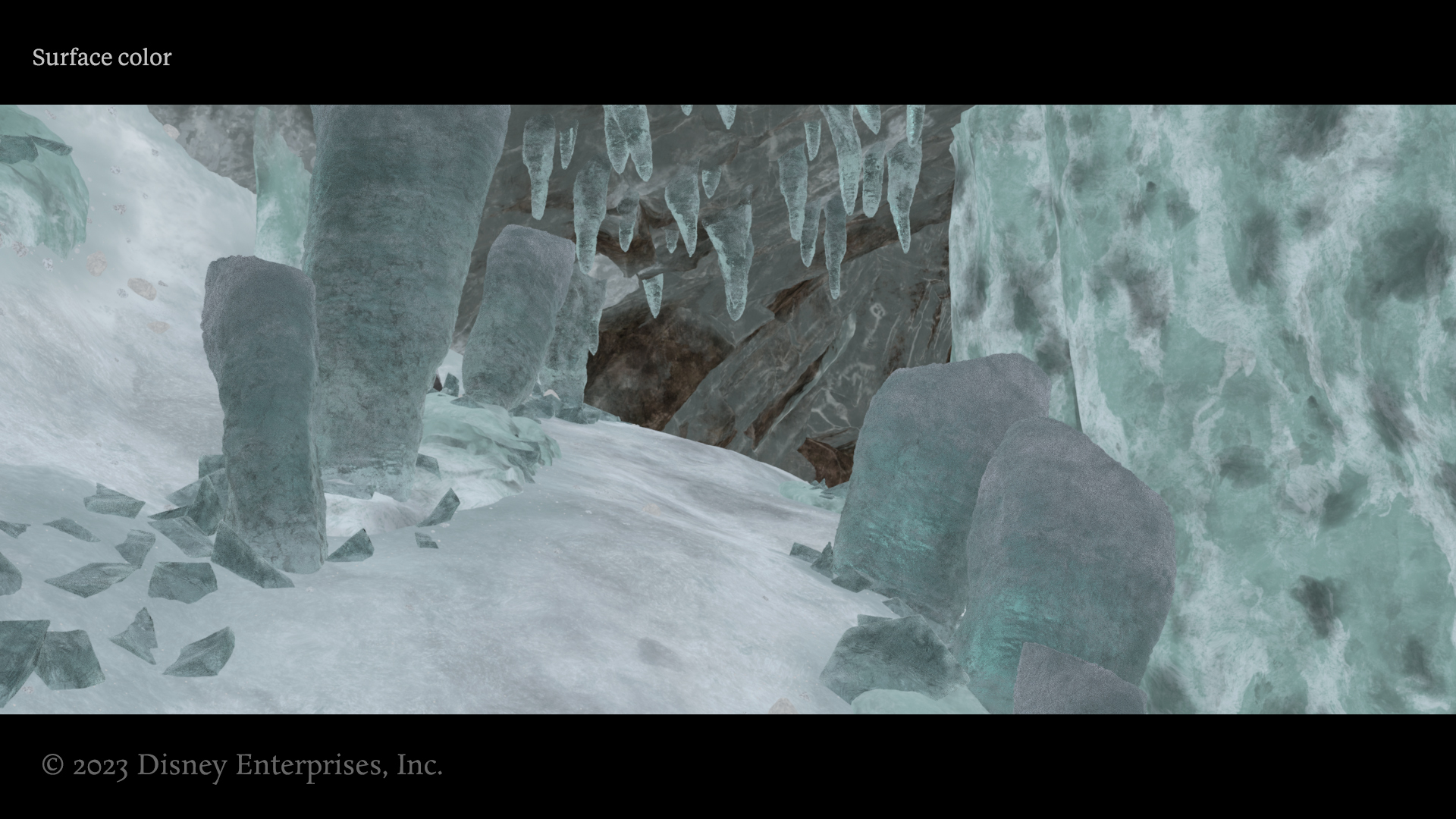
The surface color, or albedo, refers to the reflectance color of the geometry. In modern shader paradigms this is generally no longer separated from specular color and therefore must control both specular and diffuse reflectance, which has its pros and cons. I aimed to create interesting yet subtle variations in the color. It is often something overlooked by new 3D artists nowadays, as easy material presets disincentivize a careful inspection of each channel.
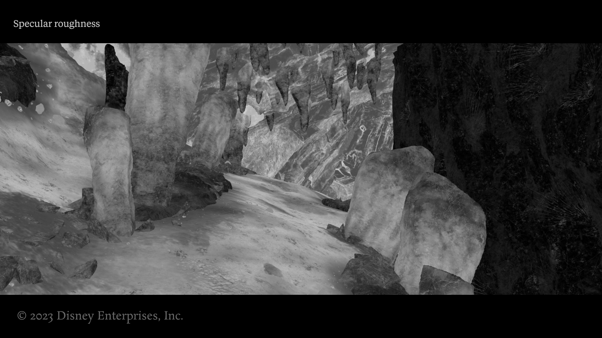
Specular roughness is one of the most important maps to get right for a very reflective material. While a diffuse material might have extremely minimal roughness variations that are all quite high, with something like ice, roughness arguably has the largest impact. This is because it impacts multiple parts of a look at once — the reflected specular shine, the clarity and feeling of transmission, the overall brightness of a surface, etc. It is a tricky map to balance. Generally, you want a lot of range and variation to give maximum control in the shader building stage. Simultaneously, you never want it to look too procedural. You want both contrast and variation, swaths of brighter and darker areas.
Along with specular roughness, there are other important maps to the look such as specular index of refraction, as well as dialing things such as transmission depth and transmission depth color. I also used a cheated secondary specular lobe to add micro sparkles or extra shine in certain areas.
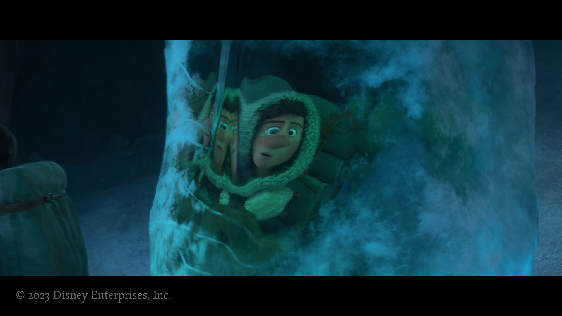
Below you can see the final shot in the film:
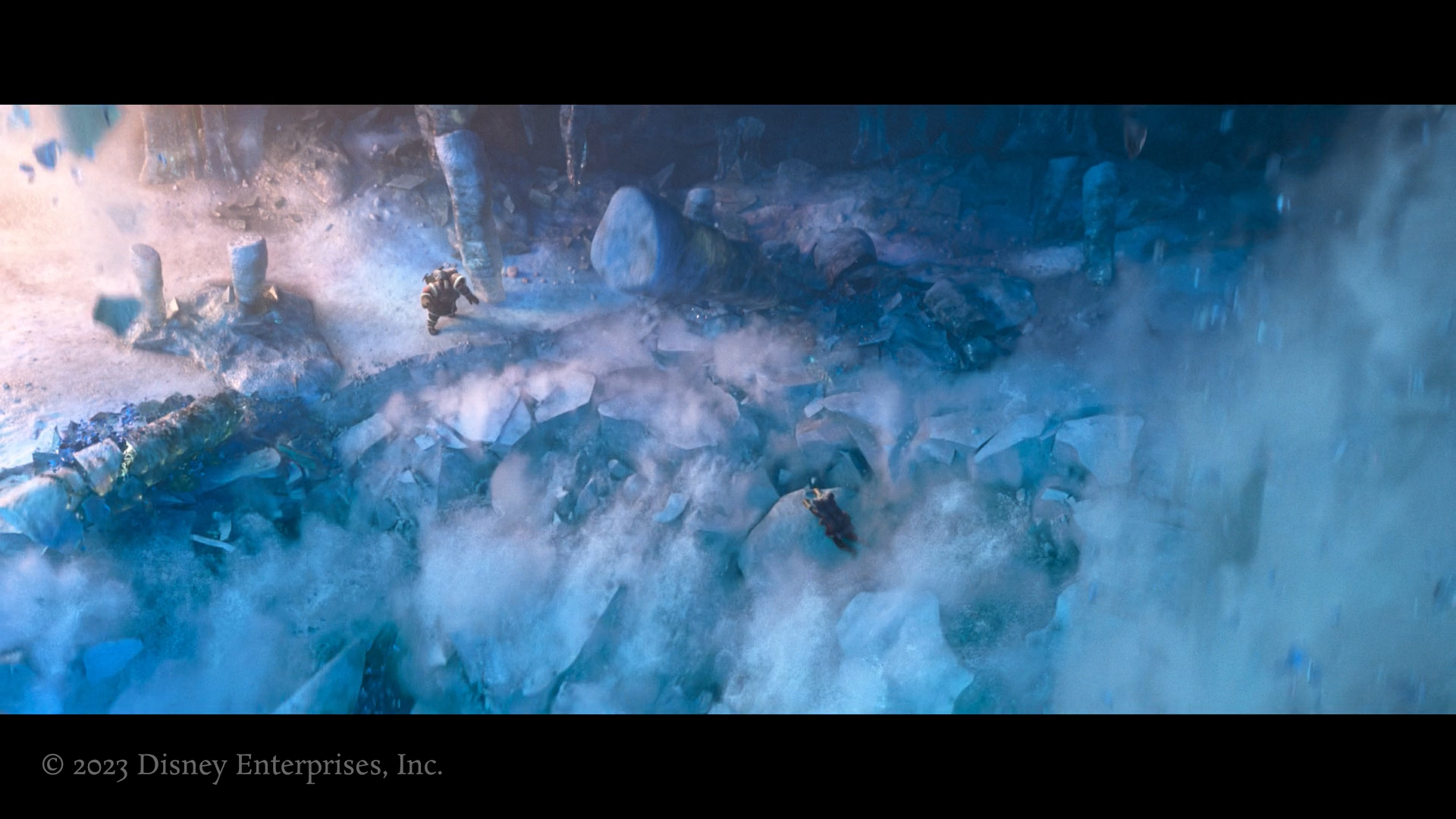
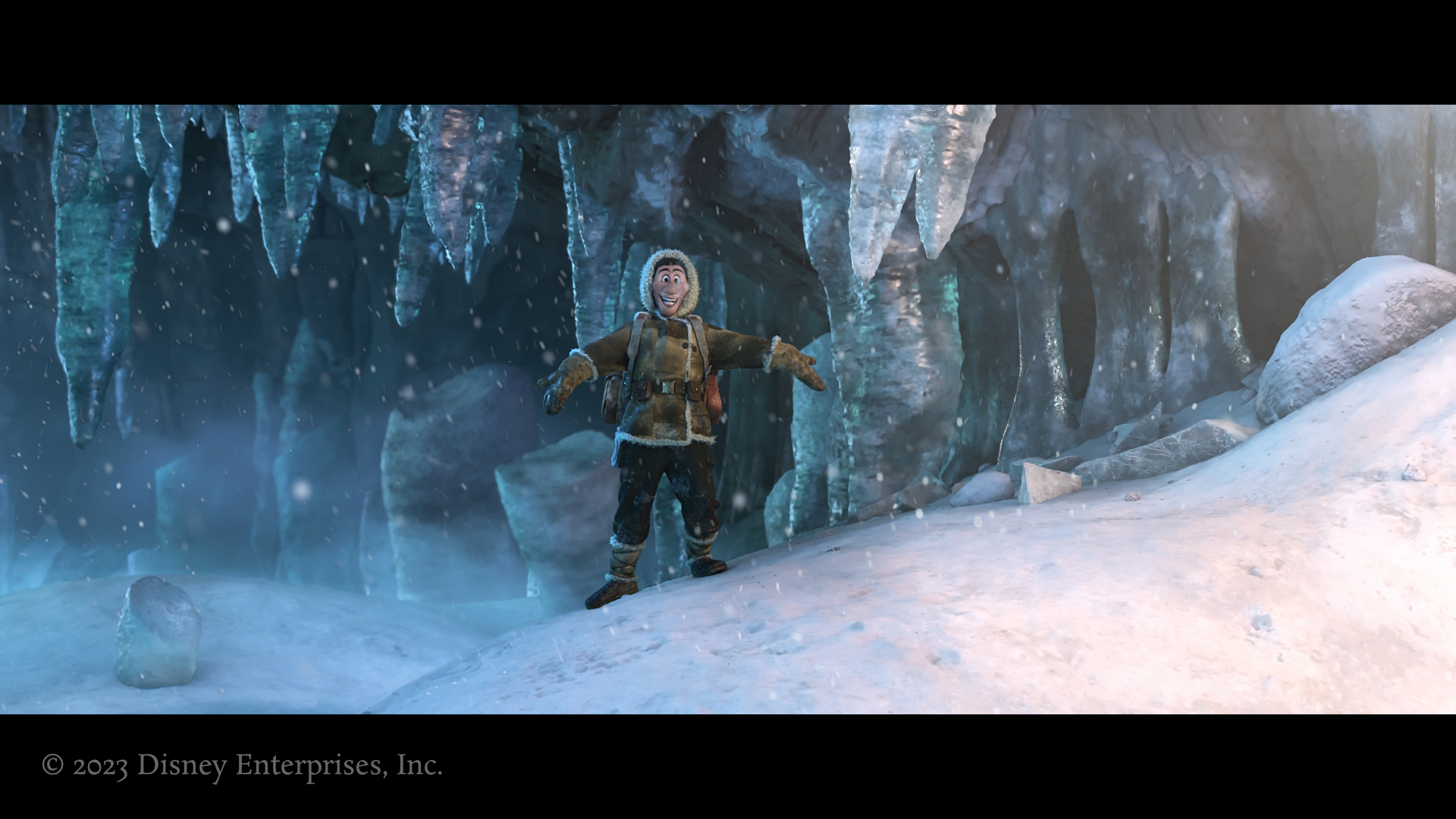
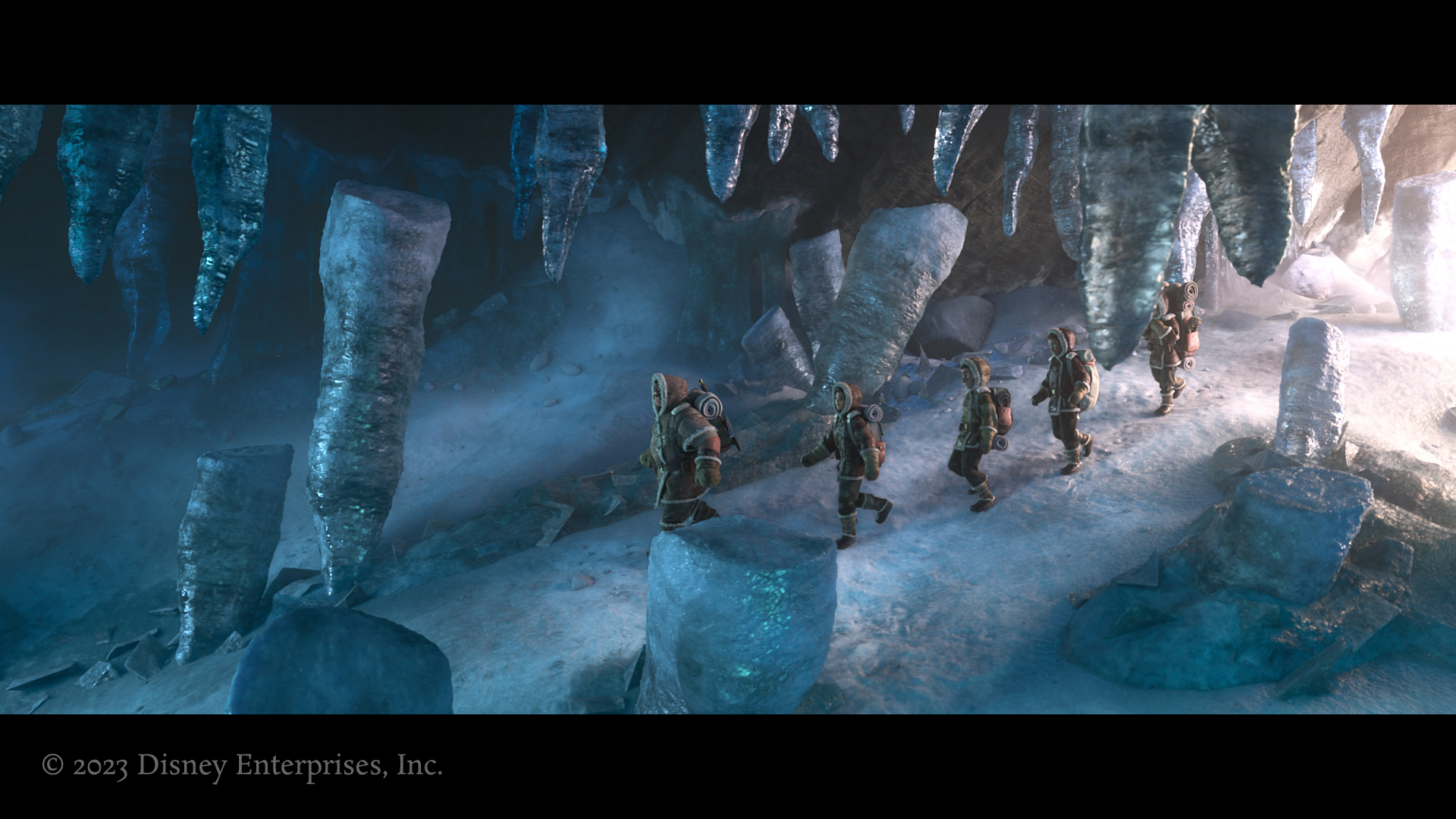
Here are some other frames of the ice environment:
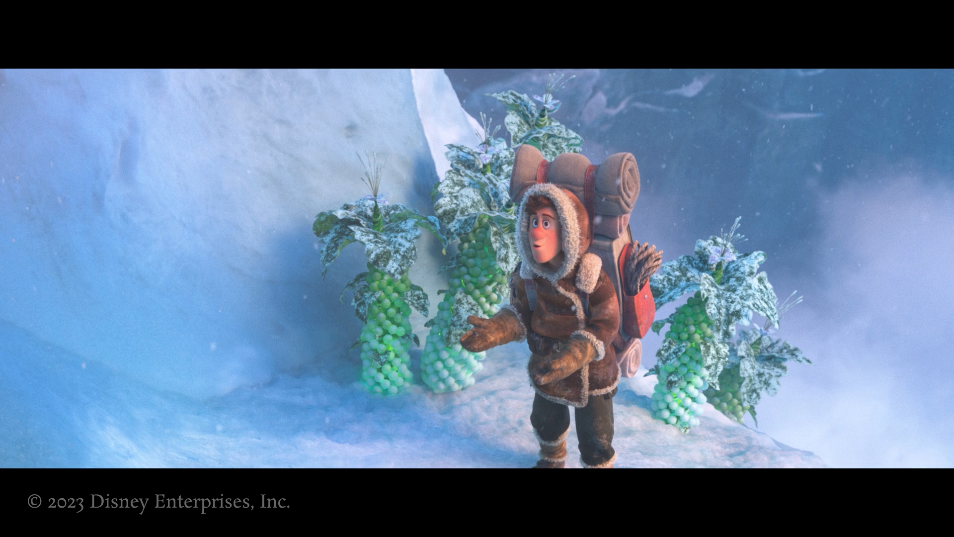
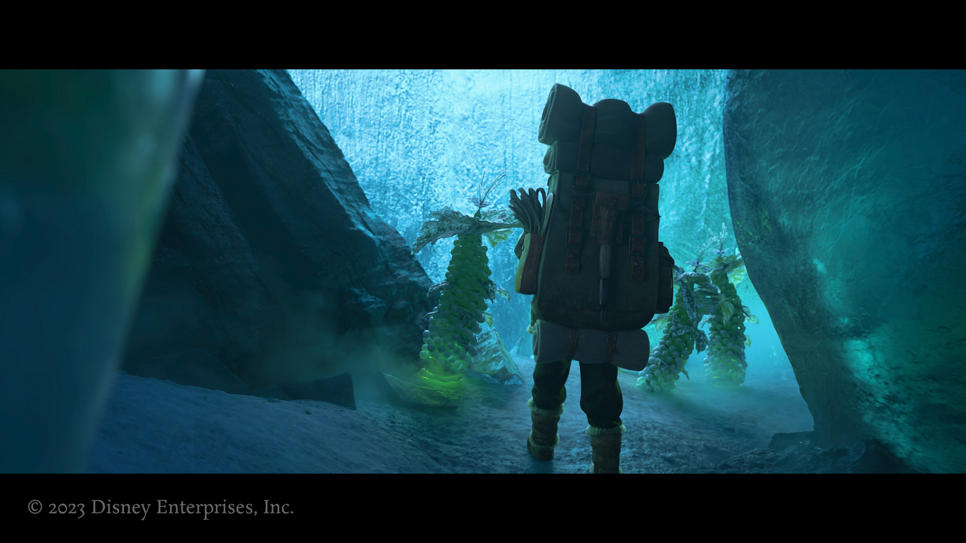
I also worked on the frosty, glowing versions of the plants.
This was a highly art directed gag that required shot-specific tweaks for the icicle.